Exploring Google Scholar with the help of graph theory
-
This project is a web scrapper that collects data from Google Scholar and returns a collaboration network.
-
Given a list of Google Scholar users, the scrapper recursively collects information about their co-authors.
-
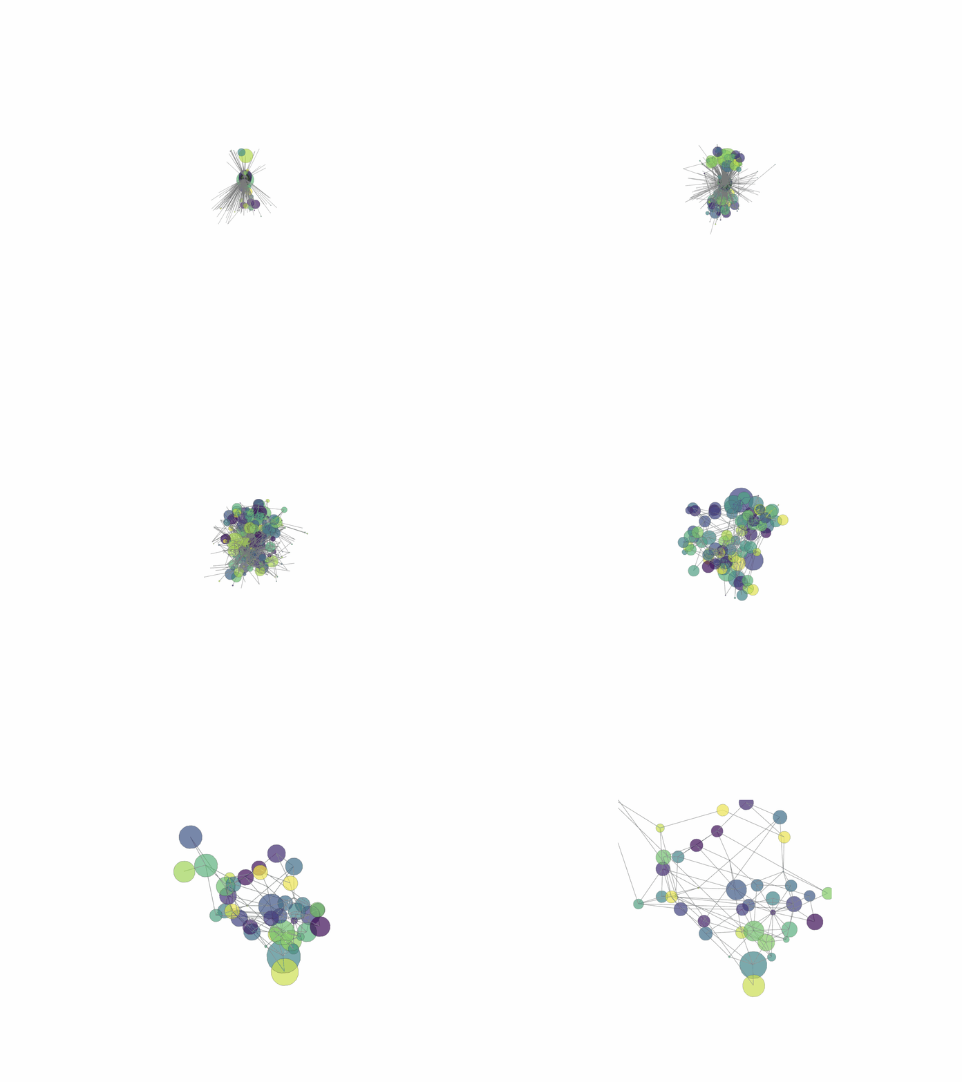
The information retrieved is organized into a graph whose nodes represent authors and edges represent publications in common.
-
The node’s size represents its “betweenness centrality,” a measure that indicates the number of shortest paths passing through it. The higher this number, the more influence the author has over the network. The color of each node denotes the author’s affiliation.
-
I use Plotly (a handy tool for displaying data in Python) to generate interactive graphs. By hovering the nodes, you can rotate the graph, zoom in and out, and learn more about the authors’ research interests.
Why it matters?
- I engineered this network to find my PhD advisor! I succeeded and found Dr Xaq Pitkow, a very active member of the scientific community who mixes ideas from control theory, machine learning, and neuroscience to find fundamental principles that give biological brains an advantage over machines when it comes to perception and mobility.
You can find the code to build your own network of collaboration here.